This post is a continuation of the article found
HERE. To see real layouts using this trend, visit this article
HERE.
This post covers:
cutting text out of splatter
cutting shapes out of splatter
cutting splatter out of shapes
cutting splatter out of text
cutting splatter out of shapes
1. paint splatter
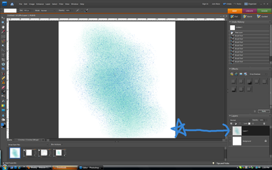
Make sure that you always paint on a new layer!
...................................................................................click "Read more" below to continue reading
Yesterday I showed you some layouts with the new airbrushing trend (go
here to see the article). Designers are actually selling paint splatter clusters. I think it's ridiculous to buy them because they are so easy to do yourself. Especially digitally. And I'll let you in on a secret: you can find
thousands of FREE airbrush and paint splatter Photoshop brushes online. For today's tutorial, you will need to go to
http://chriswahlartbrushes.blogspot.com/ and download his free brushes. There will be four parts to this tutorial (I will cover the bold ones in this post):
cutting text out of splatter
cutting shapes out of splatter
cutting splatter out of text
cutting splatter out of shapes
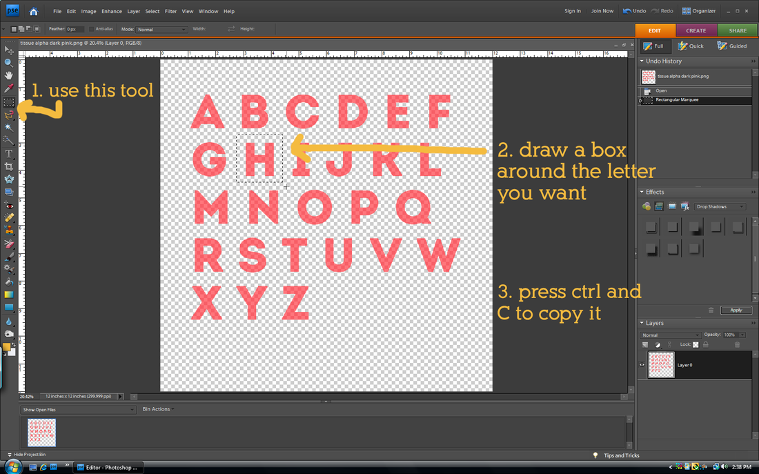
cutting out text
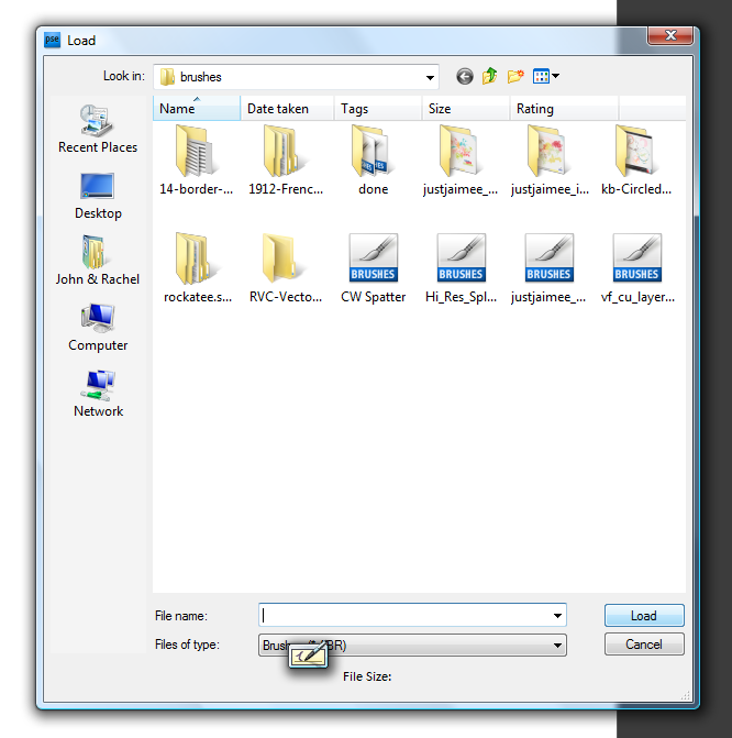
1. load brushes
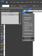 While on the brush tool, click the double arrows to find this menu. Select "Load Brushes". | 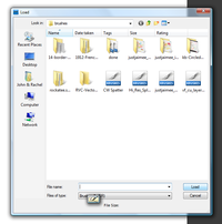 This menu will pop up. Find where your brushes are saved. Select the brushes and click "load". |
...................................................................................click "Read more" below to continue reading
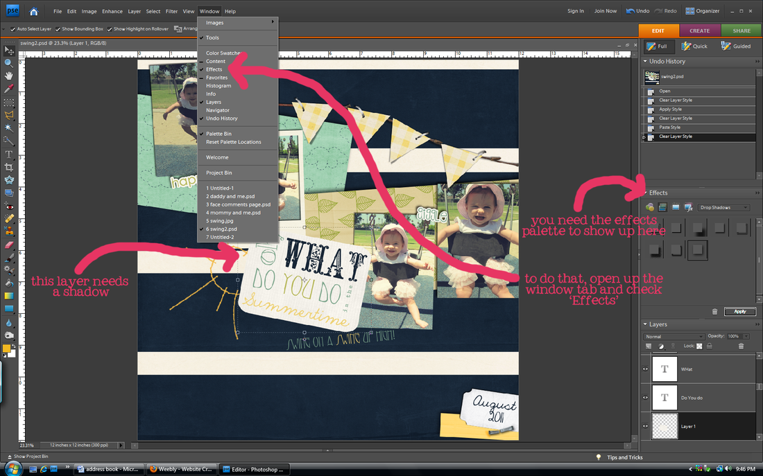
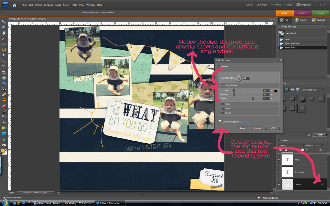
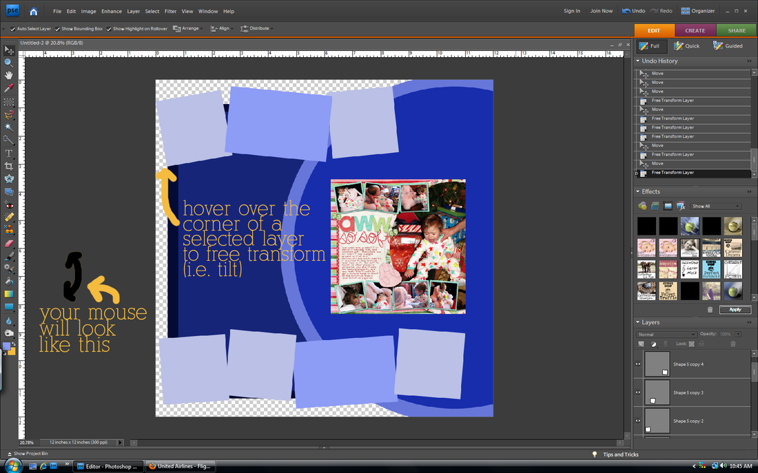
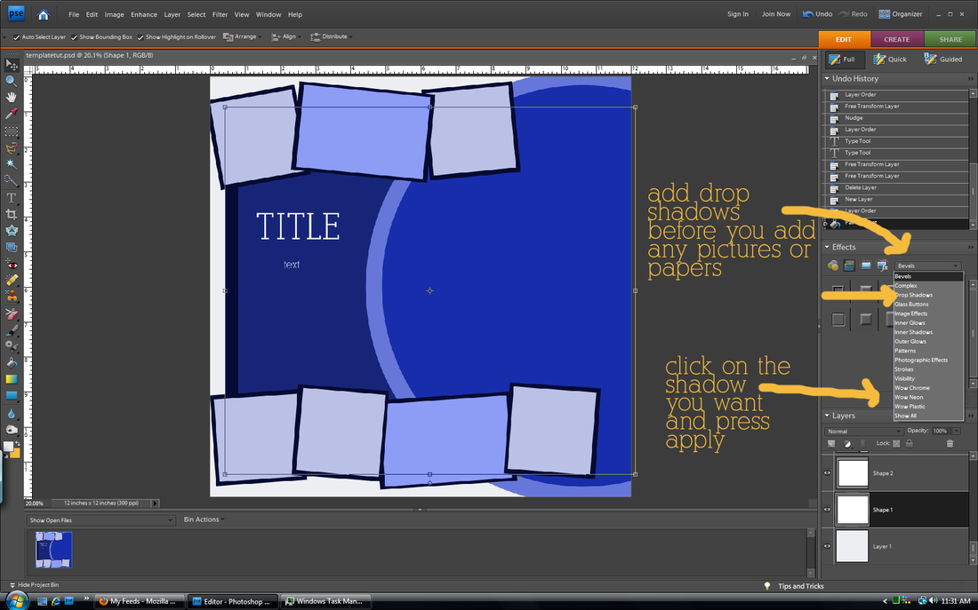
Drop shadows are key to taking a layout from looking computer-generated to looking like you made it with actual paper supplies. They add depth and realism. In order to achieve that realistic look, you have to venture out of the default drop shadow setting. I promise it is easy. (side note: I use Photoshop Elements, but in Photoshop CS you can do more things with shadows to make them look realistic like warp them and choose the blend mode. Sadly I cannot, so this tutorial will not include changing those settings)
no shadows
This has no shadows (except for the "tickles" whose shadow was saved permanently, oops). See how flat it looks?
| default shadows
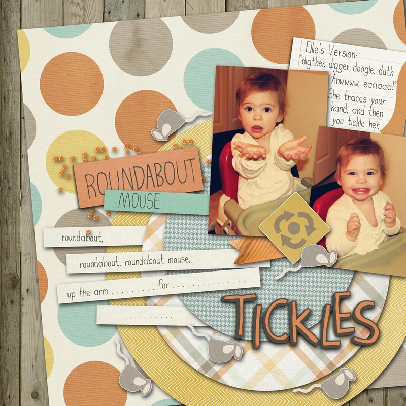
With default shadows, everything seems to be 'floating' on top of each other instead of layered. Open this up larger to really see the difference between this and altered shadows.
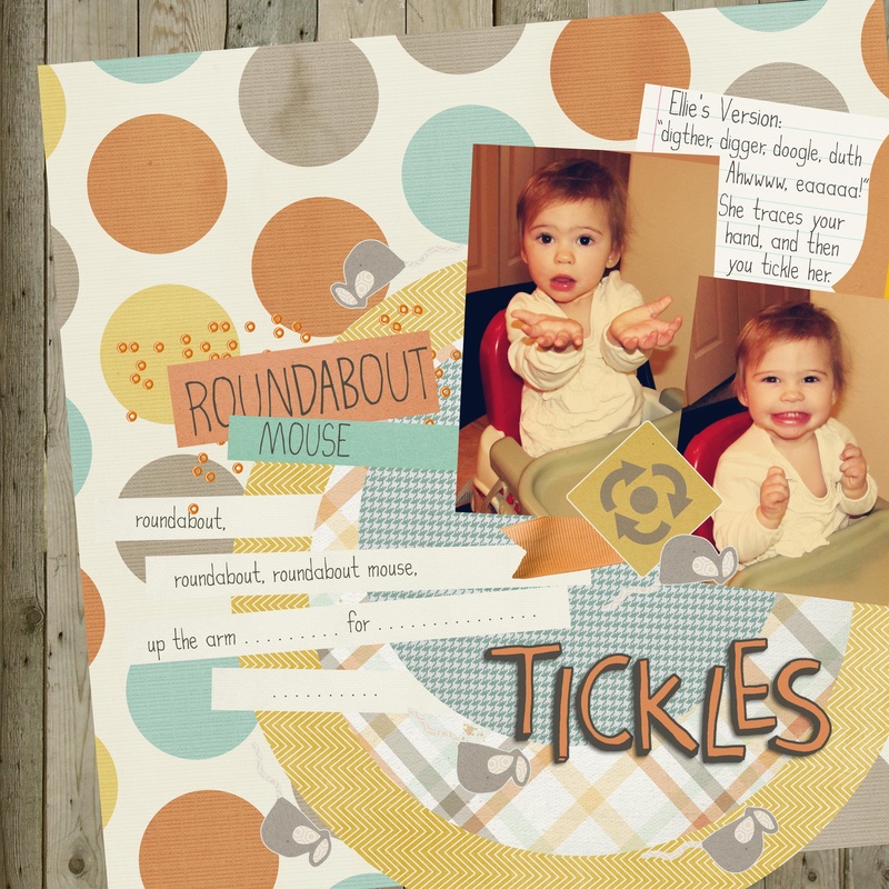
| altered shadows

This looks a little more realistic. The photos and papers look like they are 'resting' on top of the other layers rather than 'floating' in space.
|
tips
1. These are the things you can change in Photoshop Elements:
Lighting Angle- changes the angle of light and
therefore the angle of your shadow
Size- changes the size of your shadow, not to be
confused with the distance. The size will
make your shadow softer or harder on
the edges. Small size=hard edge
Distance- changes how far away your shadow
is from the layer underneath
Opacity- changes how dark the shadow is
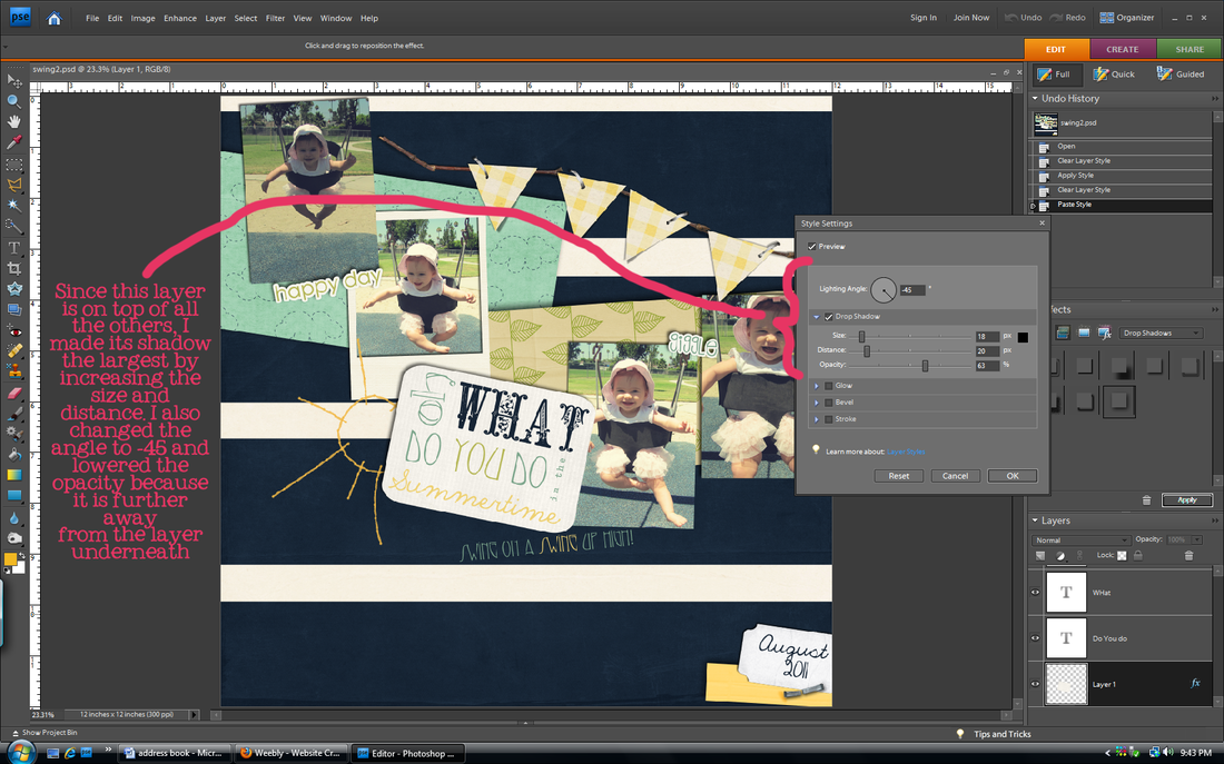
2. Vary your shadows for different objects. A button makes a larger shadow than a piece of paper or a photo. Sahlin Studio recommends the settings listed below. That's too much for me to memorize so I usually just play with the sliders until I am happy with the result.
Flat Paper/photos: distance 14/size 20
Stacked Paper/photos: distance 20/size 21
Flat Ribbons/strings: distance 33/ size 35
Ribbons/strings: distance 46/ size 49
Flowers: distance 46/ size 49
Stitches/staples: distance 7/ size 12
3. The closer an object is to the layer below, the darker the shadow will be because less light gets to it. For example, a paper sits closer to the background than a flower, so it would have a darker shadow.
4. Change the angle of the shadow. Most people use the default 120 degrees, but I think that 45 degrees or -45 degrees looks more striking. Some of my pages use 120 degrees, some 45, some -53. I like to live on the wild side, always changing.
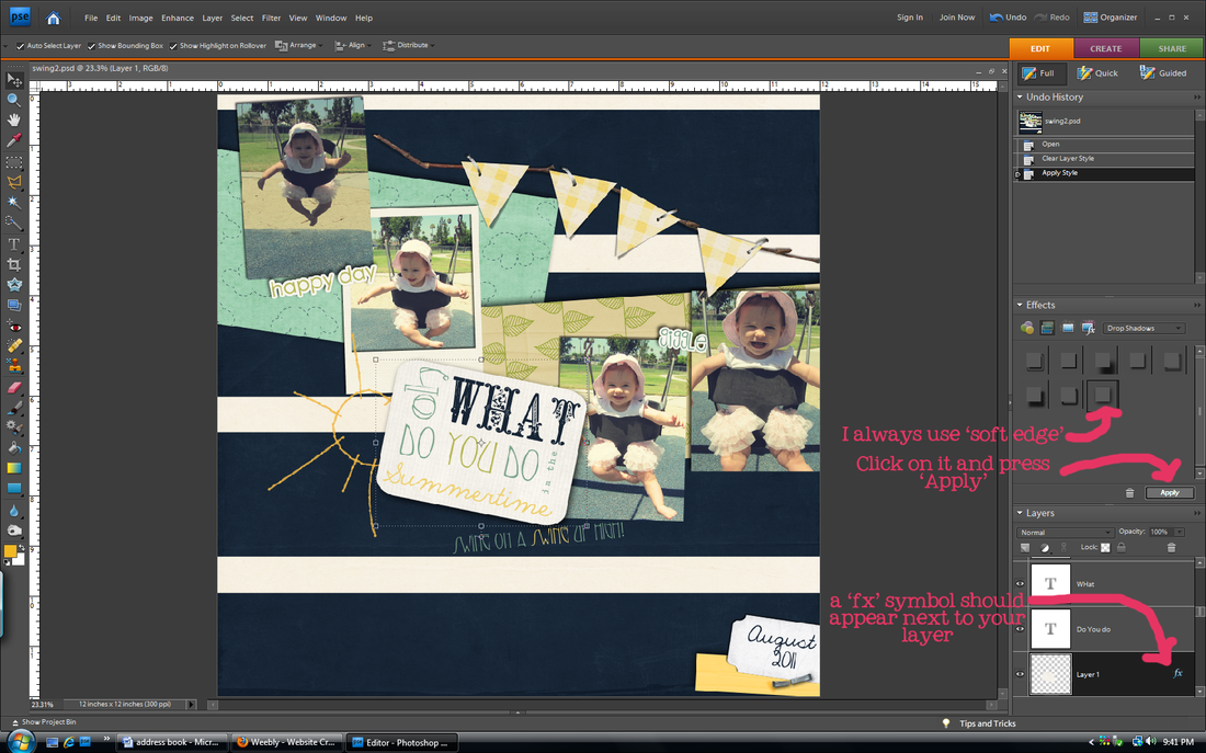
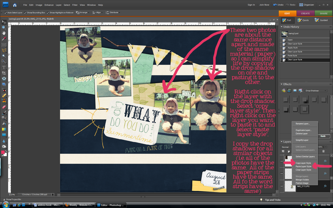
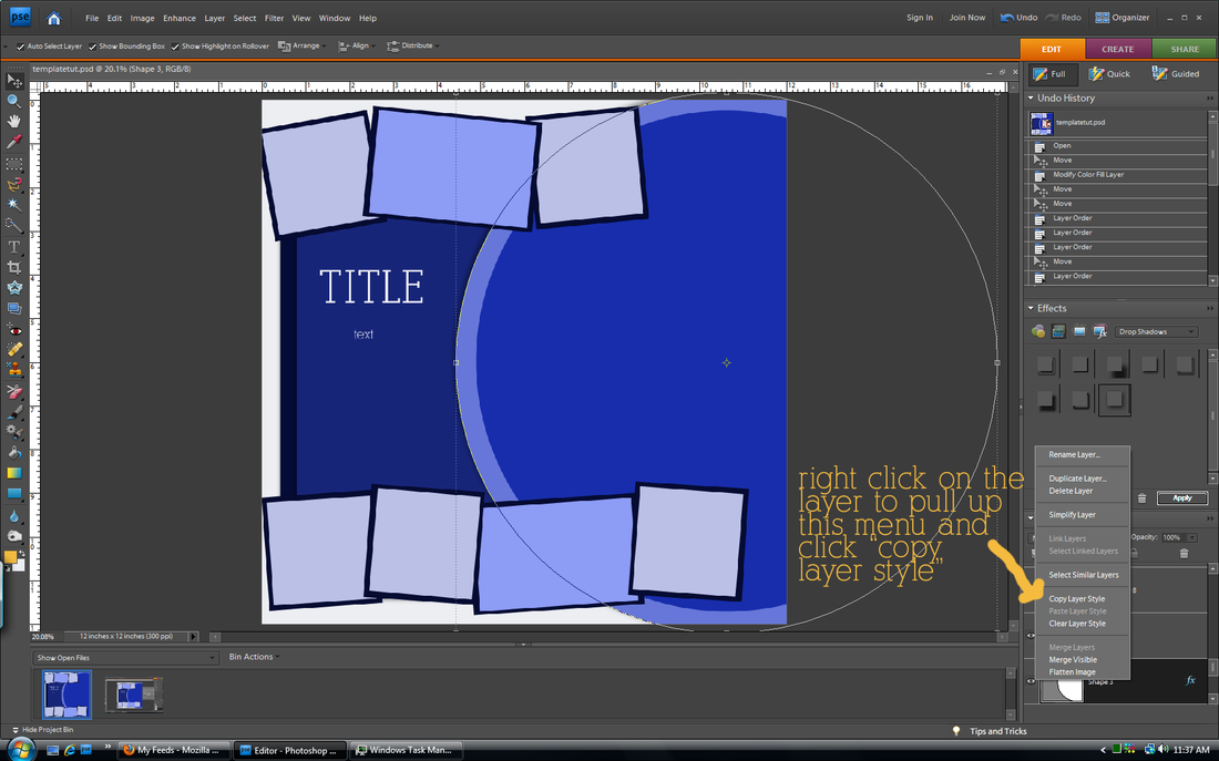
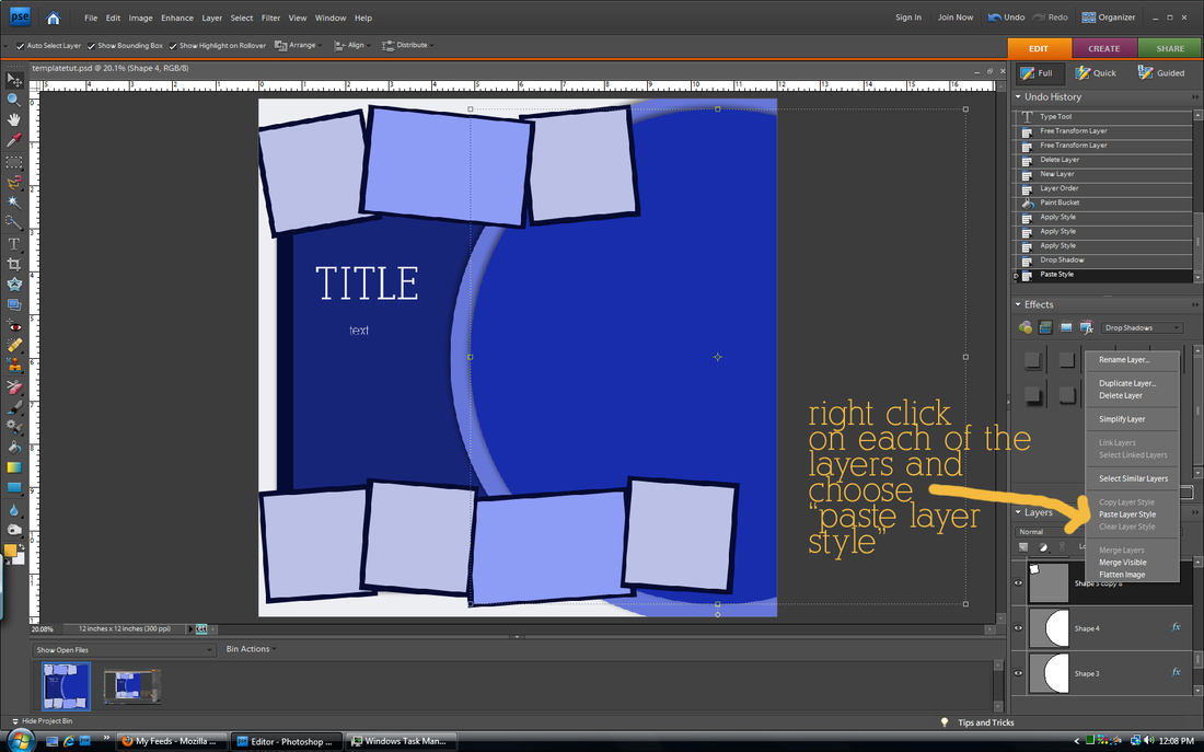
5. Once you get a shadow that you like, you can right click on that layer and 'copy layer style'. Then you can paste that layer style on any layer that you want to have the same shadow as that one. Just right click on the layer you want to paste it to and click 'paste layer style'. My friend Brittany just barely showed me this, and it is a life saver! I used to go through each layer one by one to fix the shadows! (I showed how to do this in the last step of the tutorial below)
6. Many times designers will pre-shadow templates for you. When replacing a shape with an actual element, use the method in tip #4 to copy that element's layer style before deleting it and replacing it with your own so that you can paste that layer style to your actual element.
drop shadow basics.
in other news...
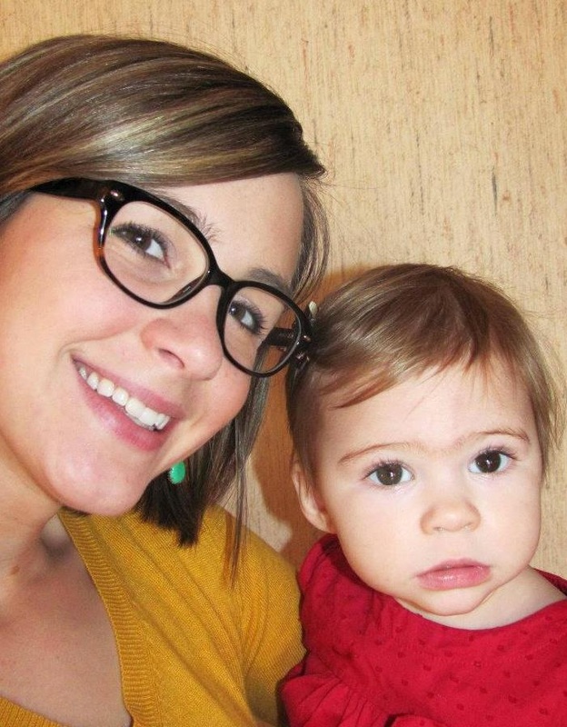
Wahoo for our first guest gallery poster! Ashley submitted her layout using the Color Me Spring kit. Didn't it turn out cute? Her daughter is adorable! Send me your layouts at
[email protected]. You know you want to. It doesn't have to be using my stuff, just layouts that you think would inspire others. If you do submit something using another designer's kits/elements/fonts just include the credits.
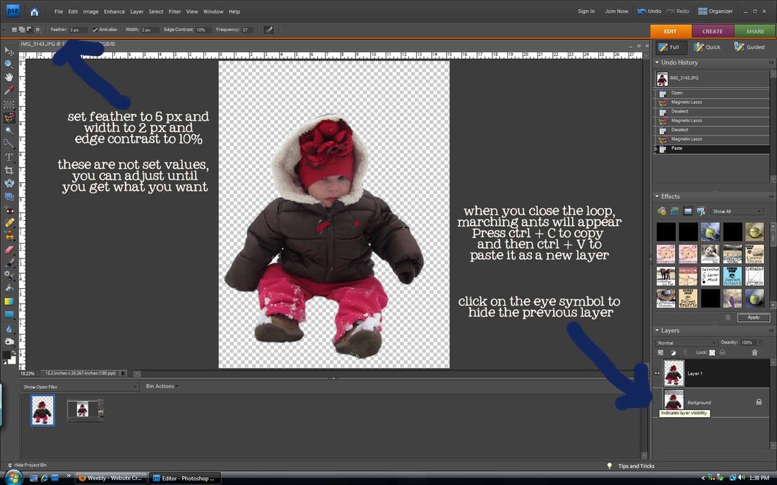
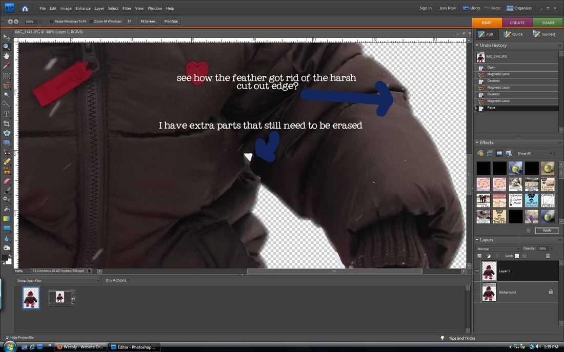
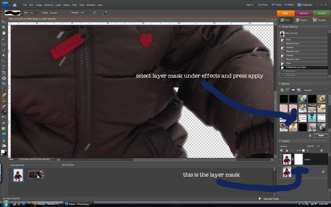
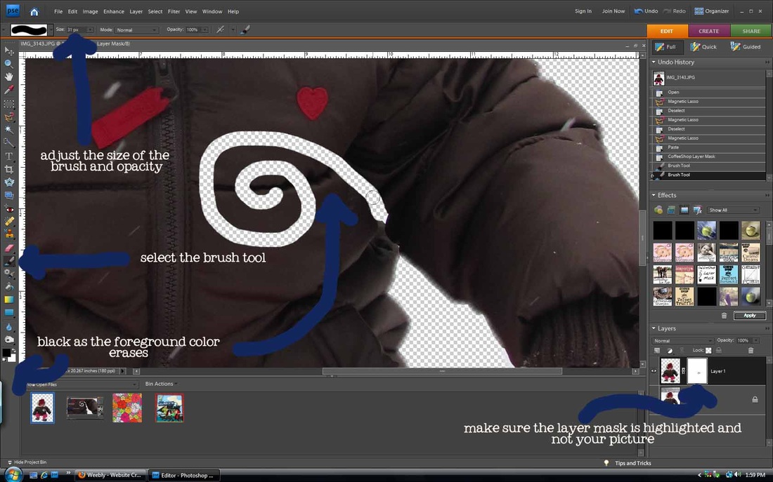
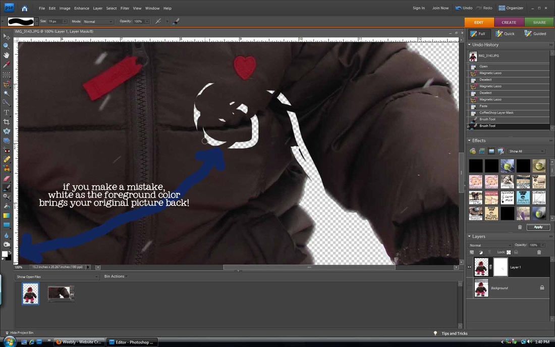
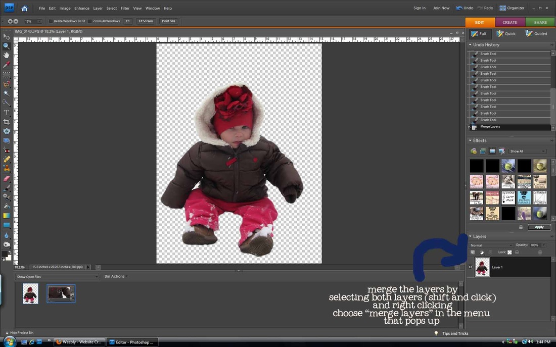
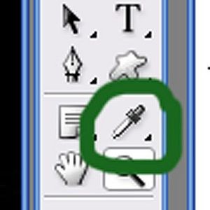
I love the magnetic lasso tool. It is so smart! It will trace along an object in your picture so you can cut it out. It isn't perfect and takes some practice, but it is lots of fun. Especially if you want to doctor pictures :). This method works best on pictures where there is high contrast between the object and the background (that's how the lasso senses where to trace). You can always fix errors by closing the loop and pressing ctrl+D to deselect the marching ants to start over. You can also cover up mistakes by using a layer mask. I used to erase the extras on my pictures, but if you erase too much, too bad, so sorry, it's gone forever. With layer masks, that is not the case. Photoshop Elements doesn't come with layer masks, but the Coffeeshop blog has created an action that will make one for you. You need to
download and install the action before doing this tutorial (it's free and easy-she has detailed instructions on her site on how to install them. scroll down to see the download button). She also has wonderful photo actions that you can apply to your pictures to make them beautiful.
cut outs using the magnetic lasso and layer masks
Make your corrections, and then move to the last step.
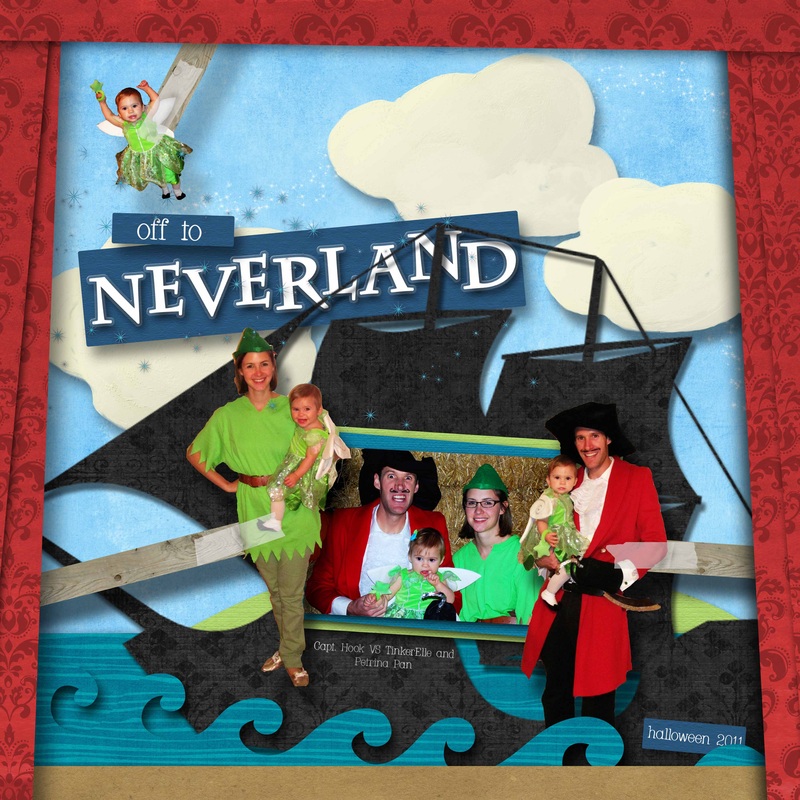
Here are two pages where I used this method. I'm not trying to be arrogant and boastful by posting the second page, it's just the only one where I used a large cut out picture. Let me know if you have questions!
I got some questions about the tutorial yesterday and other random things.
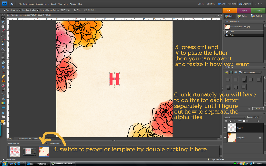
how do I use your alphas?
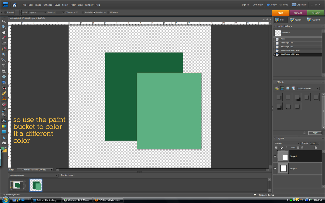
why do my shapes stay the same color instead of changing even though I used the color picker tool?
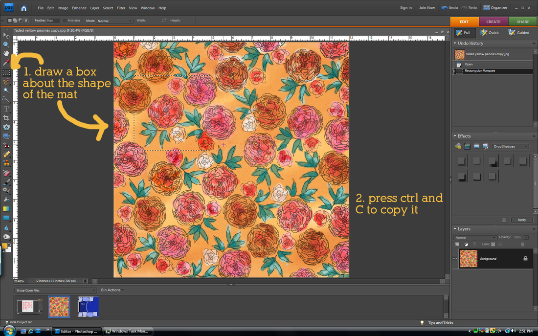
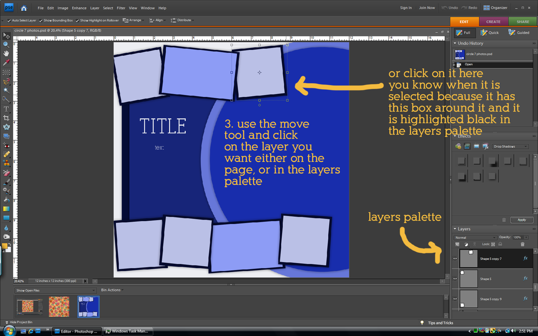
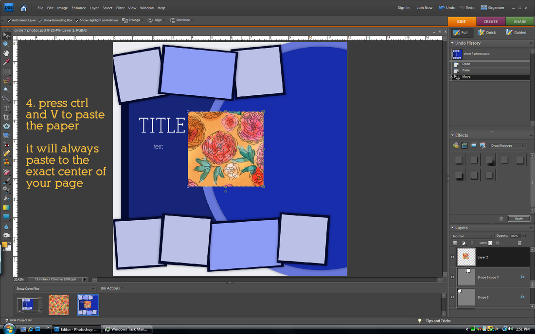
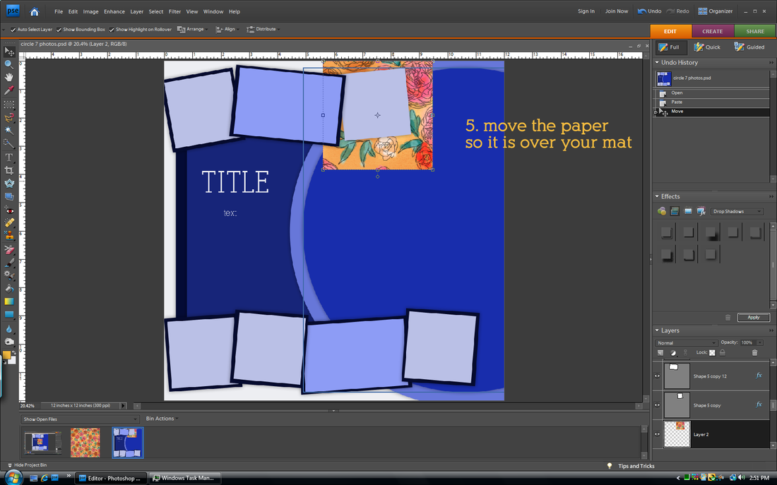
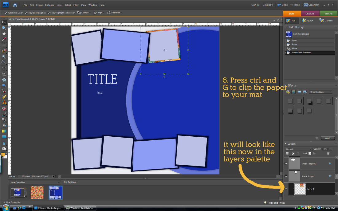
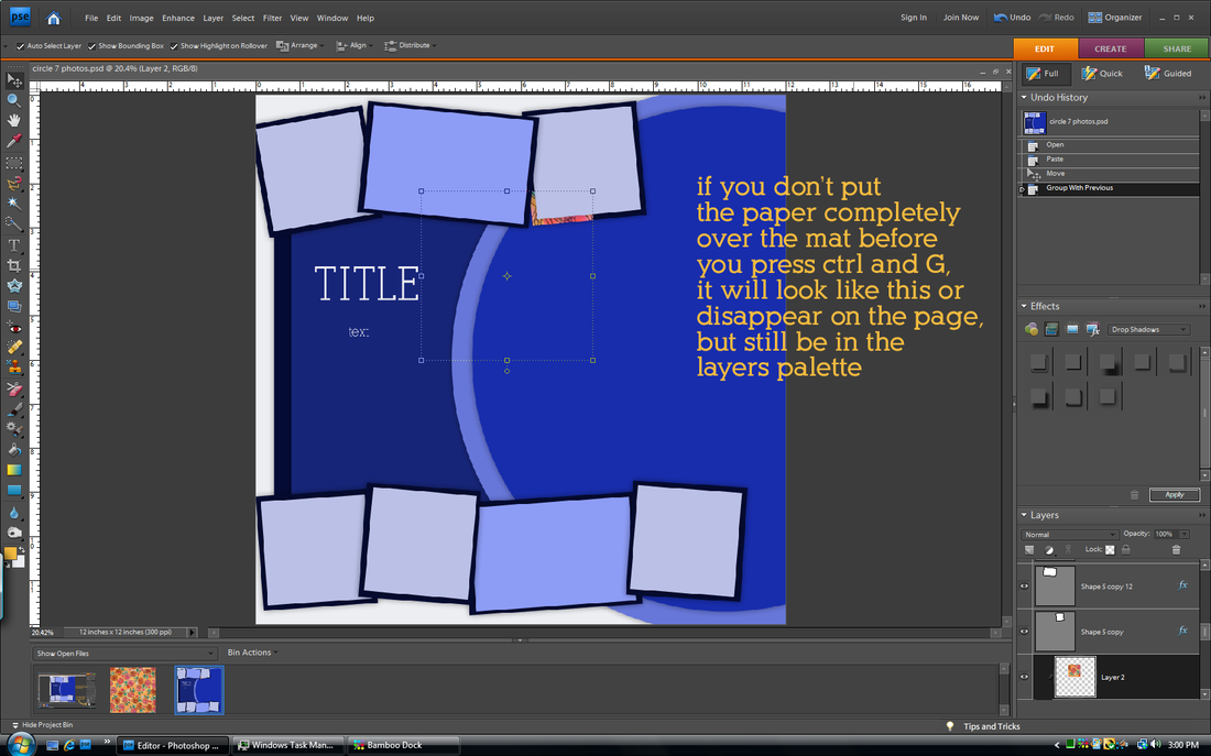
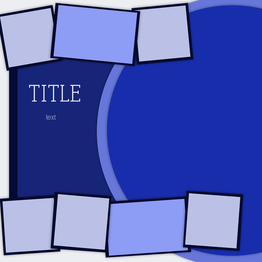
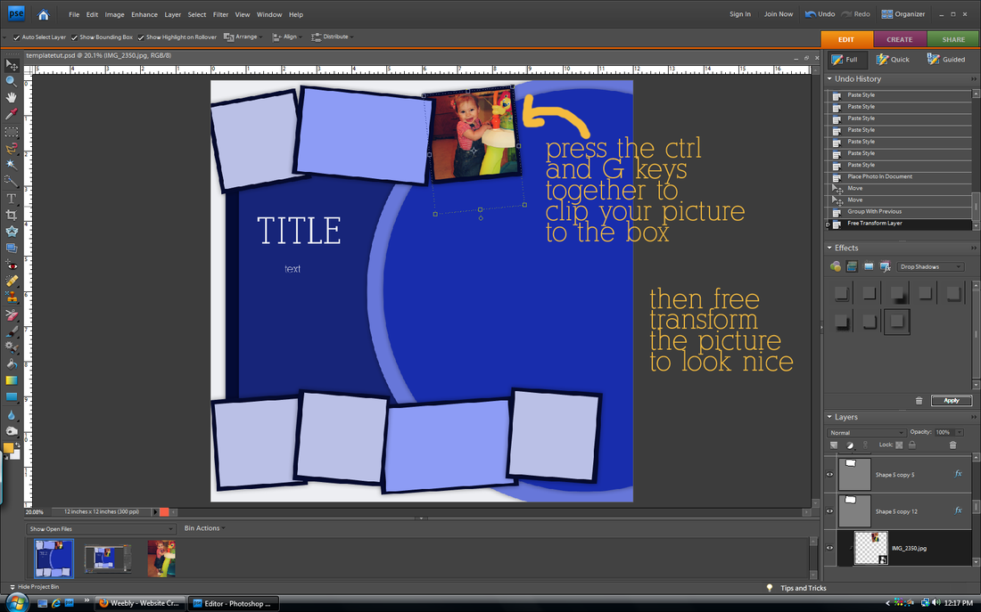
how do I get my paper to clip to my mat in the template I created?
This method will work for anything you want to clip to a shape in your template.
It's hard to see, but step three instructions is written in the blue part.
Hope that helps! As always, let me know if you have any other questions!
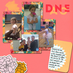
In my opinion, templates are the biggest money waster in all of digital scapbooking. First of all because most of them usually only showcase ONE or two pictures. Seriously? C'mon. (My ghetto students used to pronounce that as "see-mon") Who really only has one picture to scrap? Secondly, because they are so easy to make! Unless a layout is really fancy and includes shapes or other things I can't make myself, I choose to make my own. I learned that the hard way after doing the layout below.
layout by Cinzia Designs
|
layout using TBorges Other Colors of Christmas kit
|
Hers is cute. Mine is so ugly that it is cringe-worthy. I hate it. Plus it took me hours and hours and hours to do. Should have just bought the template. But remember that this is the exception. In the tutorial below I will show you how I made my own template from the layout on the lower left for my page on the lower right.
layout by Cami a CT for Little Green Frog Designs
|
layout used Shabby Princess Sugarplum Dreams kit
|
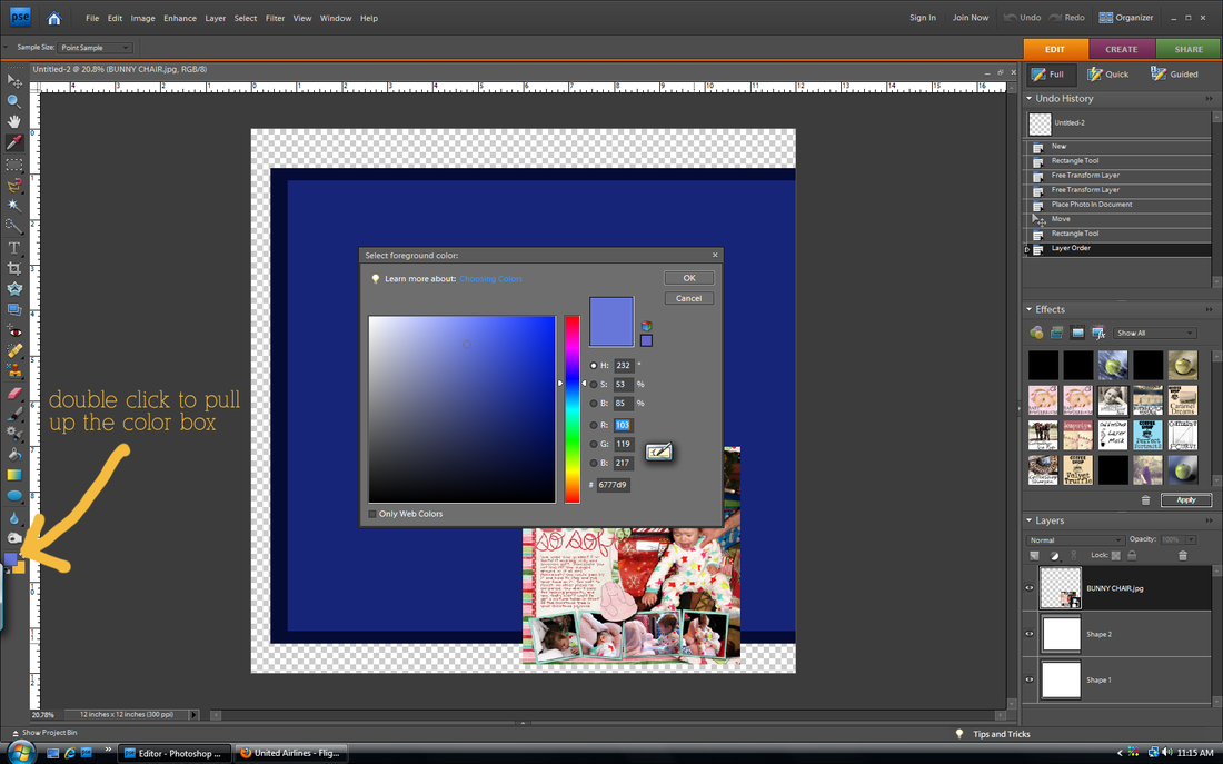
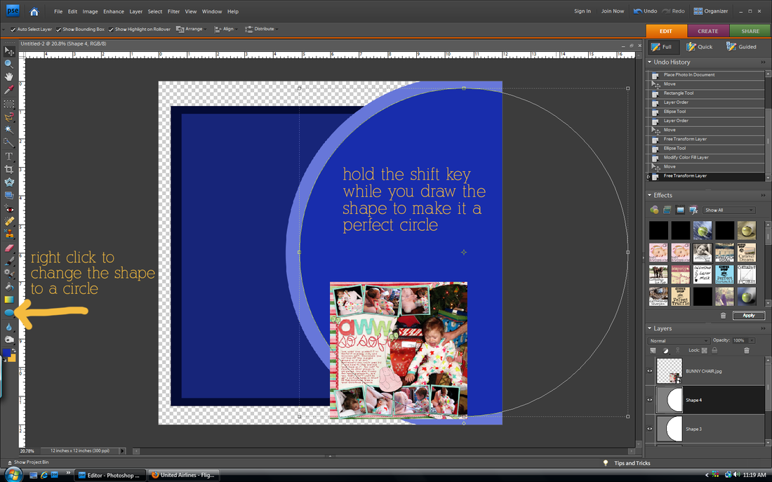
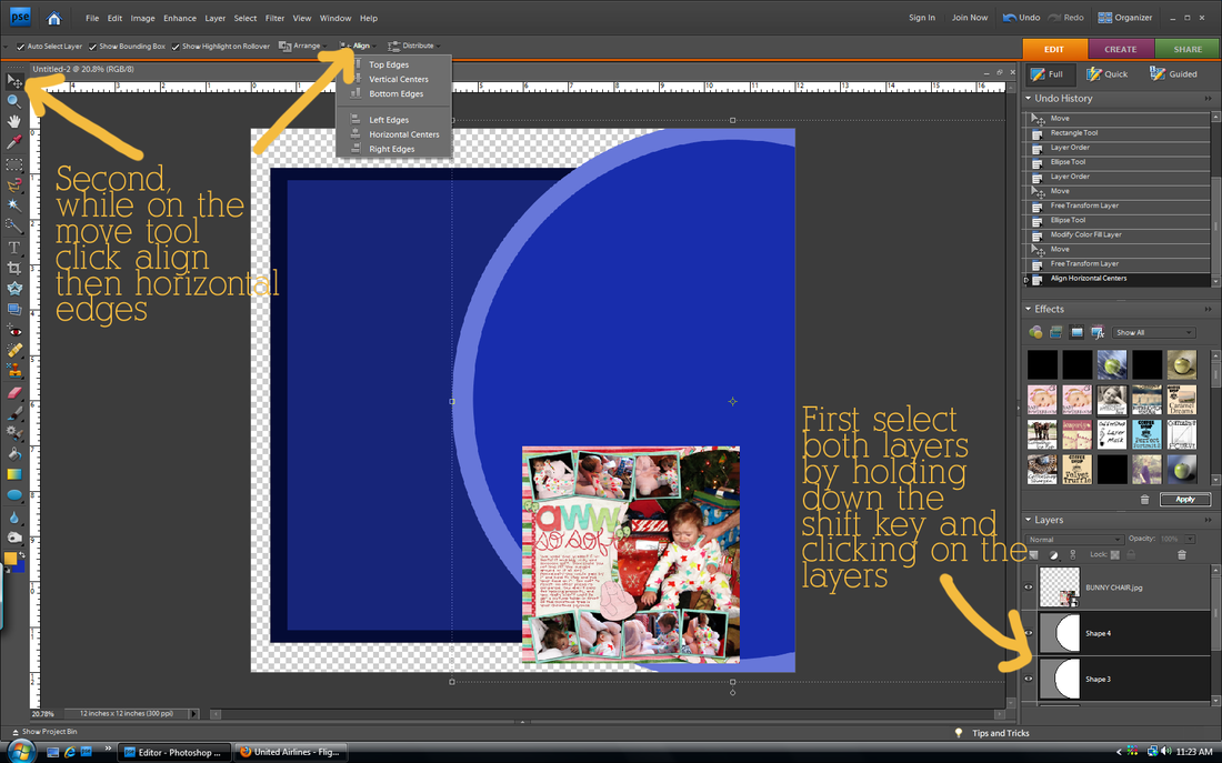
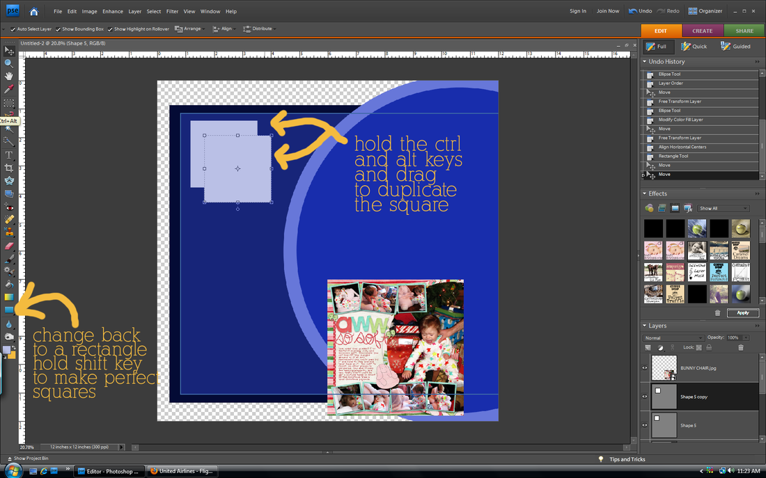
how to create your own template
draw your background shapes
Change your shape colors as you go so that each layer is a different color. Otherwise they will all blend together.
The align and distribute tools are very cool. Especially when you are making a layout with boxes that need to be lined up right and spaced evenly. Play around with it.
draw your photo shapes
That says hold ctrl and alt keys. Such a time saver!
add photo mats
add drop shadows
The default drop shadows don't always look the best. Follow the above step to customize them.
tada! template done!
SAVE!!!!! Then you can use this template over and over at the stage it is now, instead of when it has all of your pictures. You can alter it for another page, or use some of the shapes as a basis for another template you make later.
add your photos and papers
Continue clipping papers and photos to your shapes. Then you can add words, a title, and elements as you wish!
You will get faster. At first it may seem like it is not worth it to make your own, but eventually you will be a pro.
This is my first tutorial where I use the still screenshot. Let me know if it is confusing or if you have any questions!
I seriously did not know how to do this until last year (after scrapbooking for 4 years). It has saved my life. It is a good way to stretch your stash of scrapbooking supplies and get papers/elements/alphas to be the exact color that you want. And it's super easy.
step one:
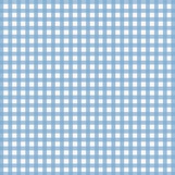
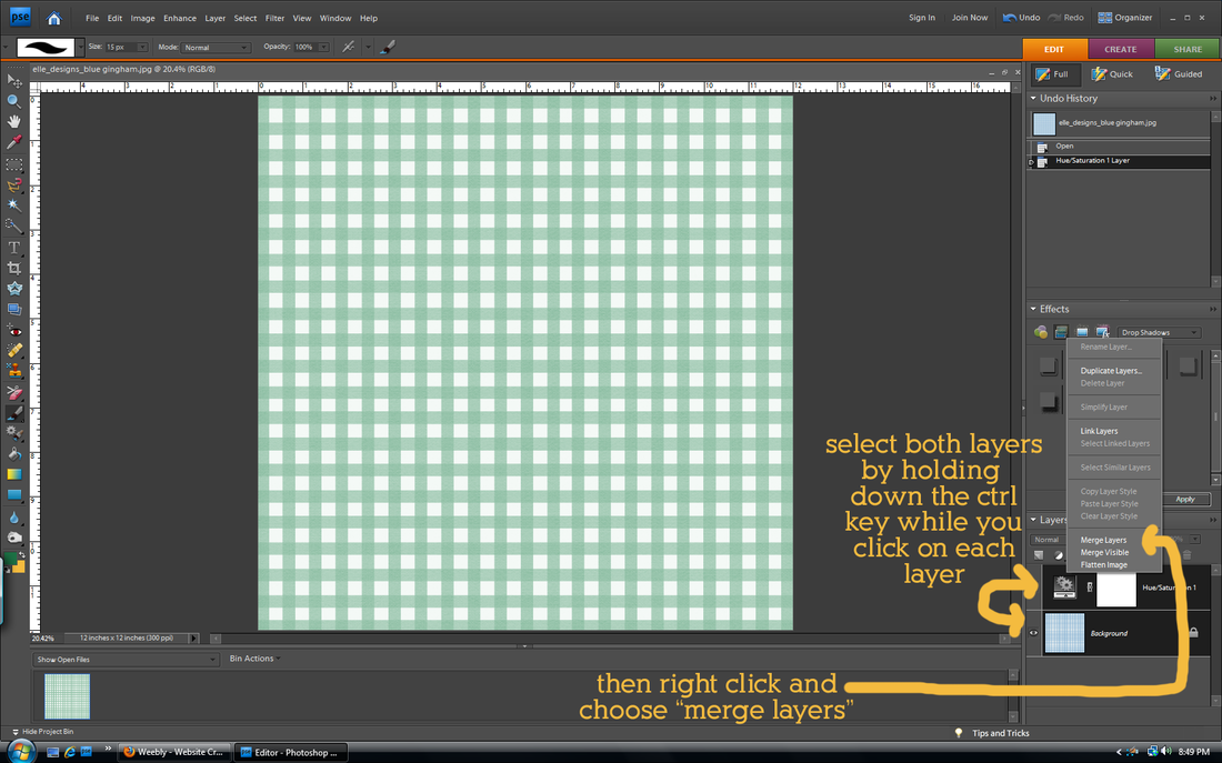
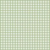
Open up your paper/alpha/element that you want to recolor. Make sure that it is the only layer open. I'm using the blue gingham paper from my farm kit.
step two:

Use your the eyedropper tool to select the color you want. You can click on a color in a photo that will be on the page if you want it to match. The color you choose should be the foreground color (it will be automatically unless you do something weird between this step and the next one). I wanted a green gingham, but it wasn't included in the kit. So I picked green from another green paper included in the kit so it would fit the same color scheme.
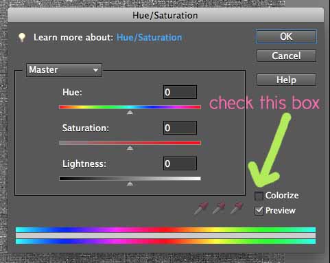
step three:

Open up your Hue/Saturation box (found in Elements by clicking on the half white/half black circle in the Layers palette or go to the Layers tab and click on New Adjustment Layer). Check the box that says "Colorize".
step four:
Adjust the hue, saturation, and lightness sliders (they are in the same box as pictured above) until you get the look that you want. The hue will change the color (but you already picked your perfect color with the eyedropper tool), so I just play with the saturation (usually has to be increased) and the lightness sliders. Then click "OK". That's it!
(updated) step five:
When you change the color, you create another layer called the Hue/Saturation layer. This will make it difficult when you move the paper to other pages, or copy and paste from the paper. To avoid problems with this, merge both layers together. Remember when you close the paper to save it as something different so you don't write over the original file!
You can do the same thing with papers with many colors on them, but the finished look isn't always the best because you can only recolor things to one color. The example below is with the animal words paper from my farm kit.
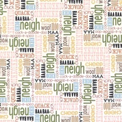 The original
| 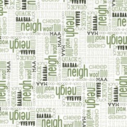 After colorizing
|
If my directions do not make sense, please ask questions!